
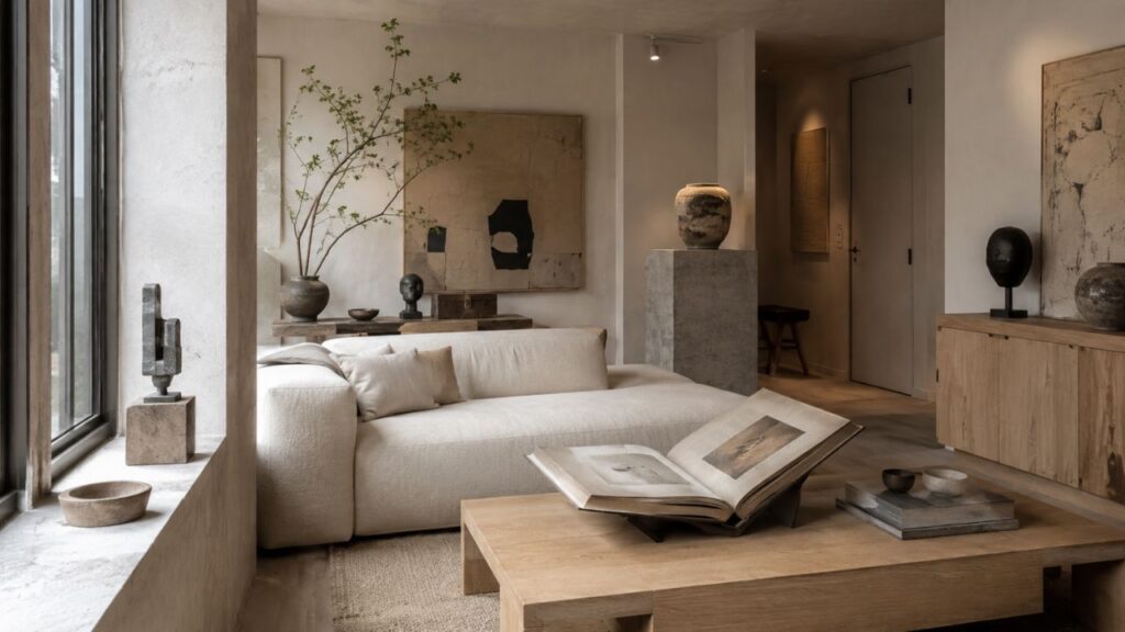
Warm white has a particular ability to make a room feel settled.
Not stark. Not overly styled. And certainly not empty.
In a considered interior, warm white works less like a decorative colour and more like an architectural foundation. It softens boundaries, responds beautifully to natural light, and gives materials such as oak, walnut, limestone, travertine, linen, and aged metal room to register.
The difference between a warm white room that feels refined and one that simply feels beige or unfinished is rarely the exact shade on the wall.
It is what happens around it.
The most successful warm white interiors rely on tonal variation, substantial materials, controlled contrast, and layered lighting. When those elements are carefully balanced, a restrained palette can have remarkable depth.

Why Warm White Works in Quiet Luxury Interiors
Pure brilliant white can create a crisp architectural effect, but it can also feel hard when paired with natural materials.
Warm white behaves differently.
Subtle undertones of ivory, chalk, oat, cream, or pale stone take the edge off a room without noticeably turning it yellow. The result is softer, particularly as daylight changes.
In the morning, warm white can pick up a gentle glow. During the afternoon, shadows reveal variations in plaster, stone, timber, and textiles. By evening, low-level lighting brings another layer of warmth.
This ability to change quietly throughout the day is part of its appeal.
Warm white does not need to become the focal point. It creates the conditions for architecture, proportion, material and light to take precedence.
Not All Warm Whites Are the Same

Choosing warm white is more nuanced than choosing between white and cream.
Some whites lean towards ivory. Others have traces of stone, beige, grey, or chalk. Even subtle differences can change how a room relates to its flooring, furniture and natural light.
Rather than choosing a colour in isolation, consider the entire material palette.
A pale oak floor may suit a soft chalk white, while dark walnut can look particularly elegant against a slightly warmer ivory. Limestone and travertine often work well with whites carrying muted stone undertones.
The aim is not to find the warmest white.
It is to find the white that makes everything else in the room feel more resolved.
Always test paint in the actual space and observe it at different times of day. The same colour can behave very differently in a bright south-facing room and an apartment with cooler or more limited daylight.
The Importance of Tonal Layering

A refined neutral interior is rarely built from one shade repeated everywhere.
Depth comes from variation.
Walls might be a soft warm white, while curtains sit slightly deeper in tone. Upholstery can introduce oat or parchment, and a wool rug might move towards stone or pale taupe.
None of these elements needs to create obvious contrast.
Their differences can be subtle.
That restraint is precisely what gives the room dimension.
A useful palette might combine:
Warm white + pale oak + limestone + oatmeal linen + aged bronze
For greater contrast:
Warm white + dark walnut + travertine + natural linen + bronze
Or for a cooler architectural interpretation:
Chalk white + smoked oak + pale stone + charcoal + brushed metal
The palette remains quiet, but it does not become monotonous.
Let Materials Create the Interest

When colour is restrained, material becomes more important.
This is where many warm white interiors succeed or fail.
A room filled with similarly smooth surfaces can feel flat regardless of how carefully the paint colour was selected. Introducing materials with different densities, grains and finishes creates depth without requiring additional colour.
Oak
Natural or lightly stained oak brings warmth and visible grain to a pale interior.
Rather than using it everywhere, allow a few substantial pieces to carry the material: a dining table, cabinetry, a console or a pair of generous side tables.
Walnut
For a richer interpretation, dark-stained or natural walnut provides controlled contrast.
Against warm white walls, its depth can make an interior feel more architectural and established without making the room visually heavy.
Limestone and Travertine
Stone introduces weight.
A honed limestone fireplace, travertine table or substantial stone console can anchor a pale room beautifully. Honed and softly textured finishes are particularly effective because they absorb light more gently than highly polished stone.
Linen and Wool
Textiles prevent a neutral room from becoming visually hard.
Full-length linen curtains, wool rugs, bouclé or softly woven upholstery introduce softness while maintaining a restrained palette.
The key is quality and proportion. One generous textile treatment generally feels more considered than several small decorative additions.
Aged Metal
Aged bronze, antique brass and other softly patinated metals introduce definition without the sharpness of highly polished finishes.
Used sparingly on lighting, hardware or occasional furniture, they can provide exactly the amount of contrast a warm white scheme needs.
Warm White and Natural Light
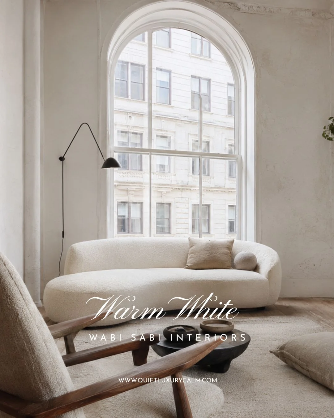
Before choosing a warm white, pay attention to how daylight enters the room.
In spaces with abundant warm daylight, an excessively creamy white can become yellow. A more restrained stone or chalk undertone may provide better balance.
Rooms with cooler daylight can often accommodate slightly warmer whites.
Artificial lighting matters just as much.
Warm white walls under overly bright or cool lighting can lose much of their softness. Instead of relying on a single ceiling fixture, build several levels of illumination through wall lights, table lamps, floor lamps and discreet architectural lighting.
The objective is not simply to make the room bright.
It is to create pools of light and areas of shadow.
That contrast gives a neutral room atmosphere after dark.
How to Use Warm White in a Living Room

A warm white living room benefits from a strong material hierarchy.
Begin with the architectural envelope: walls, flooring, windows and any existing stone or joinery.
Then introduce a small number of substantial pieces.
A linen or wool-upholstered sofa can provide softness. An oak or walnut table adds structure, while a stone side table introduces visual weight. A large rug should connect the seating rather than appear as a small decorative island beneath it.
Accessories can then be edited carefully.
A sculptural ceramic vessel, a substantial book, an artwork or a single object in stone may be enough.
The room does not need to be bare.
It needs to feel deliberate.
Warm White in the Kitchen
Warm white works particularly well in kitchens because it allows cabinetry to feel integrated with the architecture rather than visually dominant.
For a quiet luxury approach, consider warm white cabinetry alongside natural timber, honed stone and restrained metal finishes.
A combination such as warm white cabinetry, walnut joinery, limestone worktops and aged bronze hardware creates depth without depending on fashionable colour.
Details matter here.
Worktop thickness, handle proportions, cabinetry alignment, stone veining and the temperature of the lighting will have more influence on the finished room than adding another decorative colour.
The simpler the palette, the more visible these decisions become.
Warm White in the Bedroom
Warm white is especially effective in bedrooms because it creates a soft backdrop without demanding attention.
Rather than introducing several accent colours, build the room through tonal textiles.
Warm white walls can sit alongside an upholstered headboard in oatmeal or pale taupe, full-height linen curtains, crisp bedding and a wool throw.
Dark timber bedside tables or a bronze reading light can provide enough contrast to keep the scheme grounded.
Lighting should remain soft and layered.
Bedside lamps, wall lights and concealed illumination generally create a more intimate atmosphere than a bright central ceiling light.
The result should feel composed rather than pristine.
The Role of Contrast
Quiet interiors still need contrast.
Without it, even expensive materials can disappear into one another.
Contrast does not necessarily mean introducing black furniture or a strong accent colour. It can come from differences in tone, texture, scale or material.
A dark walnut table against warm white walls.
A bronze lamp beside pale linen.
A substantial travertine table on a soft wool rug.
A charcoal artwork within an otherwise tonal room.
These moments give the eye somewhere to rest.
The strongest neutral interiors know when to introduce contrast—and when to stop.
10 Common Mistakes with Warm White Interiors
1. Choosing Paint Before the Materials
Paint should respond to the flooring, stone, timber, textiles and natural light already present in the room.
Selecting a warm white first and trying to make every subsequent material work around it can make the process unnecessarily difficult. Establish the material palette first, then choose a white that supports its undertones.
2. Making Everything the Same Tone
A warm white sofa against warm white walls, paired with an almost identical rug and curtains, can leave the room without definition.
Stay within a restrained palette, but allow subtle shifts between ivory, oat, stone, taupe and deeper timber tones. Tonal variation gives a quiet room structure.
3. Relying on Accessories for Depth
If a room feels unfinished, adding more cushions, objects and decorative pieces is rarely the best solution.
Look first at scale, lighting, textiles and material contrast. The room may need a larger rug, fuller curtains, a more substantial table or better lighting, rather than more objects.
4. Using Too Many Small Pieces
Quiet luxury depends heavily on proportion.
Several small tables, lamps and accessories can create more visual noise than one or two generously scaled pieces. Fewer, better-proportioned elements give a room greater presence.
5. Ignoring the Finish
Gloss can dramatically change how a neutral material behaves.
Highly reflective surfaces bounce light around the room and can make a restrained palette feel harder. Honed stone, matte paint, softly finished timber and brushed or aged metals tend to create a quieter result.
6. Choosing the Wrong Undertone
Not every warm white works with every room.
A yellow-based white may feel heavy beside cool grey stone, while a pink-toned white can become more noticeable against golden timber. Test several shades beside the room’s permanent materials and observe them throughout the day.
7. Depending on One Light Source
A single ceiling fixture can flatten a warm white room and create harsh shadows.
Layer ambient, task and accent lighting through sconces, floor lamps and table lamps. Warm white interiors feel most considered when light arrives from several heights and directions.
8. Leaving Out Darker Anchors
A pale room still needs visual weight.
Walnut, bronze, charcoal, deep olive or soft black can provide definition without creating severe contrast. Used sparingly, these deeper notes prevent warm white from feeling washed out.
9. Treating Every White Surface Equally
Walls, upholstery, curtains and painted joinery do not need to match exactly.
Each surface responds differently to light and texture. A softly chalked wall, creamy linen curtain and ivory wool rug can share a color family while creating distinct layers of depth.
10. Mistaking Restraint for Emptiness
Removing visual noise does not mean removing character.
A warm white interior still needs a focal point, material hierarchy and a sense of occupation. One substantial artwork, a sculptural lamp, a stone table or a carefully edited shelf can give the room presence without disturbing its calm.
Warm white succeeds when it is treated as a layered material palette, not a single color. Calm is not created by sameness, but by carefully controlled variation.
A Simple Warm White Material Palette
If you are starting from an empty room, a restrained material framework can make decisions easier.
Walls: Warm chalk or ivory white
Timber: Natural oak or dark walnut
Stone: Limestone or honed travertine
Textiles: Linen and wool in oat, parchment and stone
Metal: Aged bronze or antique brass
Contrast: Charcoal, deep brown or dark timber
Lighting: Warm, layered and low-glare
This is not a formula that every room needs to follow exactly.
Think of it as a hierarchy.
Begin with the architectural surfaces, establish one dominant timber and stone, soften them with textiles, and introduce darker accents only where the room needs definition.
Why Warm White Endures
Warm white is often described as timeless, but its longevity has little to do with the colour alone.
It endures because it allows other elements of an interior to carry the character.
A beautiful piece of timber can deepen with age. Stone develops subtle variation. Linen softens. Bronze gains patina. Artwork can change without requiring the entire room to be reconsidered.
Warm white gives those materials space.
It also adapts.
Furniture can become darker, artwork can become more expressive, and textiles can change with the seasons while the architectural foundation remains relevant.
That flexibility is particularly valuable when creating a home intended to feel considered for years rather than styled for a moment.
A successful warm white room is therefore not simply a white room with expensive furniture.
It is a study in proportion, texture, material and light.
When those elements are carefully resolved, warm white stops feeling empty and begins to feel architectural.
And that is where calm becomes something more enduring than a look.
It becomes part of how the room feels.
More on Quiet Luxury Interiors
Organic Modern in Historic Homes | Quiet Luxury Design
Mid Century Modern House Ideas: When Mid Century Modern Meets Quiet Luxury
7 Wabi Sabi Principles: The Japanese Philosophy Behind Timeless Interior Design
10 FAQs About Warm White Interiors
1. What is a warm white interior?
A warm white interior uses whites with soft cream, beige, yellow or red undertones. The result feels gentler and more inviting than a room built around crisp, blue-based whites.
2. How do I choose the right warm white paint?
Begin with the room’s permanent materials, including flooring, stone and timber. Test several large paint samples beside them and observe each color in morning, afternoon and evening light.
3. Do warm white interiors look too beige?
They can if every surface has the same undertone and depth. Combine ivory, oat, stone and taupe with natural wood, honed stone and a few darker accents to create definition.
4. What colors work well with warm white?
Warm white works particularly well with walnut, soft taupe, muted olive, charcoal, dusty blue, aged bronze and restrained terracotta. Keep the palette limited and softly balanced.
5. Can warm white work in a small living room?
Yes. Warm white can make a small room feel open without becoming cold. Use a few generously scaled pieces, full-height curtains and controlled tonal variation to maintain calm.
6. Which materials add depth to a warm white room?
Linen, wool, honed stone, walnut, oak, refined boucle, aged brass and bronze add depth through texture and finish. Their differences should feel subtle rather than strongly contrasting.
7. What lighting is best for warm white interiors?
Layered lighting with warm bulbs usually creates the most refined result. Combine ambient light with floor lamps, table lamps and wall sconces to produce a soft, dimensional glow.
8. Should the walls, trim and ceiling use the same white?
They can, but varying the finish often creates better definition. Alternatively, use closely related whites with compatible undertones so the transitions remain soft and composed.
9. How do I keep a warm white room from feeling empty?
Introduce material hierarchy, substantial furniture and one clear focal point. A stone table, sculptural light, oversized artwork or dark timber element can give the room presence without adding clutter.
10. Are warm white interiors timeless?
Warm white interiors can feel timeless when they are grounded in proportion, quality materials and restrained contrast. Their longevity comes from thoughtful composition rather than dependence on a passing color trend.


