
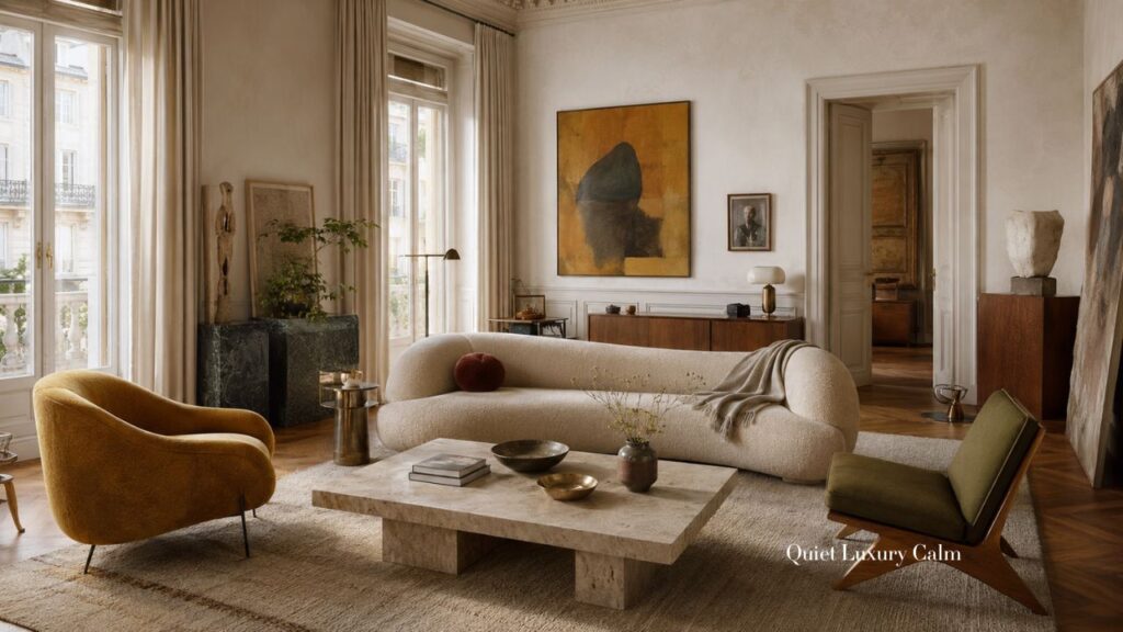
Introduction
Organic modern design is often reduced to a familiar formula: pale walls, soft curves, light wood, and very little color. It can feel peaceful, but it can also become predictable.
Milanese interiors offer another interpretation. Here, calm does not come from removing personality. It comes from controlling it. Architecture, natural materials, expressive furniture, art, and color can all exist together without competing for attention.

This is organic modern beyond beige: sophisticated, collected, tactile, and quietly luxurious.
1. Let the Architecture Lead
A refined interior begins with the room itself.
Rather than treating architecture as a background for decoration, Milanese homes allow proportions, windows, doorways, floors, walls, and ceiling height to establish the rhythm.
Furniture should respond to that architecture. Larger rooms often benefit from fewer, more substantial pieces rather than many small ones. Art should feel appropriately scaled. Curtains can emphasize height, while clear pathways allow the room to breathe.
Even without historic architectural details, the principle works.
Identify the strongest line or proportion in the room and reinforce it rather than fighting against it.
This is where restraint becomes different from minimalism. Minimalism often asks how much can be removed. Restraint asks which elements deserve to remain.
2. Use Natural Materials With Precision
Organic modern design depends heavily on natural materials, but refinement comes from how those materials are used.
Wood brings warmth. Stone adds permanence and visual weight. Linen softens both architecture and daylight. Wool creates comfort and absorbs sound. Metal introduces a sharper, more precise note.
The goal is not to make everything look rustic or handmade.
Natural materials can be beautifully finished and still retain their character. Wood can appear in tailored cabinetry. Stone can be smooth and architectural. Upholstery can feel inviting while maintaining a strong silhouette.
This creates an important balance between softness and structure.
Instead of filling the room with many small natural textures, allow a few materials to have greater impact. One substantial surface can often create more atmosphere than several decorative accessories.
Quiet luxury comes from quality, scale, and placement rather than quantity.
3. Move Beyond Beige Without Losing Calm

A calm home does not have to be a beige home.
The Milanese approach demonstrates how color can be sophisticated without becoming loud. The key is choosing colors with complexity and depth rather than relying on highly saturated tones.
Muted mineral shades, earthy pigments, softened architectural colors, smoky tones, and deeper natural hues can all belong within an organic modern interior.
More important than the individual color is the relationship between colors.
A cooler element can sit beside warmer wood. A deeper upholstery tone can be softened through linen or plaster. A stronger artwork can become the focal point while everything around it remains quieter.
The palette can have personality while still being limited.
That limitation is important. When every object introduces another competing color, visual calm disappears.
Beyond beige does not mean more color everywhere. It means using color with greater confidence and greater restraint.
4. Balance Curves With Stronger Lines
Soft, rounded furniture has become almost synonymous with organic modern design. But when everything is curved, the room can begin to lose definition.
The strongest interiors balance softness with structure.
A generous sofa can sit beside a more architectural table. Sculptural seating can be balanced by disciplined shelving. A substantial piece of furniture can be contrasted with a slender lamp or precise metal detail.
These opposites give the room tension.
Furniture should also have enough presence for the space around it. Several undersized pieces can make a room feel busier than two or three larger forms.
Comfort remains essential, but every piece should contribute something beyond comfort: proportion, silhouette, texture, or visual weight.
The result feels relaxed without becoming shapeless.
5. Create a Collected Interior
Quiet luxury rarely looks as though everything arrived on the same day.
Mixing different periods gives an interior depth. Contemporary furniture can sit beside vintage pieces. A refined object can coexist with something worn or imperfect. Recognizable design can be mixed with anonymous pieces chosen simply because their proportions are right.
This creates the feeling of a home that has developed gradually.
The objective is not to display as many interesting objects as possible. It is to allow individual pieces enough space to matter.
Patina becomes particularly valuable here. A slightly aged surface can prevent a sophisticated room from feeling too polished.
The home becomes elegant, but also believable.
And that sense of time is one of the most convincing forms of luxury.
6. Treat Art and Objects as Part of the Room
Art should not feel like something added at the end simply because a wall was empty.
It can establish scale, create a focal point, introduce contrast, or change the emotional character of a room.
One substantial work may be more powerful than several smaller pieces. Elsewhere, a looser grouping can create intimacy and personality.
The same editing applies to objects.
Books, vessels, trays, sculptures, and personal pieces are important because they make a home feel inhabited. But every surface does not need decoration.
Choose where visual interest should occur and allow other areas to remain quiet.
Negative space gives important objects more presence.
Perfect symmetry is not always necessary either. Slight irregularity can make a sophisticated room feel more natural. The composition remains intentional, but it avoids looking staged.
7. Layer the Lighting
Lighting is one of the most important elements of quiet luxury.
Instead of relying entirely on bright overhead illumination, create several levels of light.
Floor lamps can define seating areas. Table lamps create smaller zones of intimacy. Wall lighting can reveal texture and architectural depth. More discreet lighting can emphasize shelving, cabinetry, or artwork.
The goal is not to make the room dark. It is to avoid illuminating everything equally.
When some areas are brighter and others are allowed to recede, the interior gains depth. Materials become more dimensional. Furniture feels more sculptural. Art becomes more prominent.
Shadow is part of the atmosphere.
During the day, natural light should also be considered as a material. Soft fabrics, textured surfaces, and thoughtful furniture placement allow changing daylight to continually alter the character of the room.
8. Give Every Room Its Own Character
A cohesive home does not require every room to repeat exactly the same palette or furniture language.
What should repeat is the level of restraint.
An entrance may need only one strong piece, art, and carefully considered lighting.
A living room can rely on generous furniture and clear spacing.
A dining area can become more focused, with a substantial central table and lighting that creates intimacy around it.
A library can tolerate greater visual density because books naturally provide texture and rhythm.
Bedrooms can become softer and more personal, while bathrooms and smaller spaces may support stronger material decisions because their scale contains them.
Each room can have a distinct atmosphere while still belonging to the same home.
Consistency comes from judgment, not repetition.
9. Bring the Look Into a Real Home
You do not need to redesign an entire home to adopt this approach.
Begin by editing.
Remove small objects that do not contribute meaningfully and see what the room feels like with more breathing space.
Then look at scale. If everything feels small or fragmented, consider whether one larger piece could provide an anchor.
Examine the material balance. If the room feels too pale and soft, introduce greater depth through one substantial material or furnishing. If it feels heavy, create relief through lighter textiles, quieter surfaces, or additional negative space.
Before buying more decoration, consider whether the room actually needs better lighting, stronger art, improved furniture placement, or simply fewer objects.
And allow the interior to evolve.
A collected home is difficult to create instantly because part of its beauty comes from objects being discovered, kept, moved, inherited, and reconsidered over time.
More On Quiet Luxury
Warm White in Wabi Sabi Interiors: How to Layer a Calm, Timeless Home
Organic Modern in Historic Homes | Quiet Luxury Design
7 Wabi Sabi Principles: The Japanese Philosophy Behind Timeless Interior Design
The Hamptons: Quiet Luxury Interiors That Feel Effortlessly Elegant
Watch Video Featuring 100+ Organic Modern Interior Design Ideas
See how color, natural materials, sculptural forms, and quiet luxury come together in these Milan-inspired interiors.
10 Common Organic Modern Color Palette Mistakes
1. Using Too Many Similar Beige Tones
Layering beige upon beige can make an organic modern interior feel flat rather than sophisticated. Introduce subtle contrast through warmer woods, stone, muted color, or deeper accents.
2. Choosing Neutrals With the Wrong Undertones
Not all whites, creams, taupes, and beiges work together. Mixing conflicting yellow, pink, gray, or green undertones can make an otherwise restrained palette feel unsettled.
3. Avoiding Color Completely
Organic modern does not require a colorless interior. Olive, ochre, terracotta, tobacco, muted blue, burgundy, and mineral greens can bring depth while preserving calm.
4. Adding Too Many Accent Colors
Going beyond beige does not mean introducing color everywhere. A limited palette of two or three supporting hues usually feels more refined.
5. Using Highly Saturated Colors
Very bright colors can overpower the natural materials that define organic modern design. Muted, earthy, smoky, and mineral-based shades tend to integrate more naturally.
6. Forgetting About Wood as a Color
Walnut, oak, teak, and other woods contribute significant color to a room. Their undertones should be considered part of the overall palette rather than treated as neutral background materials.
7. Ignoring Stone and Natural Materials
Marble, travertine, limestone, plaster, linen, wool, and metal all introduce their own tones. Build the palette around these permanent materials rather than choosing paint colors in isolation.
8. Making Every Surface the Same Value
A room composed entirely of pale colors can lose dimension. Combining light, medium, and occasional darker values creates depth without sacrificing tranquility.
9. Choosing Colors Without Considering Natural Light
The same color can appear dramatically different throughout the day. Always consider how warm or cool daylight interacts with your organic modern palette.
10. Treating Black as the Only Way to Add Contrast
Black can provide definition, but it isn’t the only option. Deep olive, espresso brown, charcoal, bronze, oxblood, or dark walnut can create softer, more sophisticated contrast.
Closing
Organic modern design does not have to mean endless beige, pale timber, and identical curved furniture.
The Milanese interpretation is richer and more personal. Natural materials are refined rather than overly rustic. Color is controlled rather than avoided. Furniture balances comfort with structure. Art contributes personality, and lighting creates depth.
Nothing needs to shout for attention.
That is the essence of quiet luxury: not the absence of richness, but the careful editing of it.
A memorable interior gives every material, object, and piece of furniture enough space to be noticed—and enough restraint to belong.
10 FAQs About Organic Modern Color Palettes Beyond Beige
1. What colors work best in an organic modern color palette?
Warm whites, cream, taupe, stone, mushroom, earthy brown, olive, sage, ochre, terracotta, muted blue, charcoal, and other softened natural shades work particularly well.
2. Does organic modern have to be beige?
No. Beige is common because it creates a quiet foundation, but organic modern interiors can incorporate considerable color when the palette remains controlled and connected to natural materials.
3. How do you add color to an organic modern interior?
Start with one muted or earthy color and repeat it selectively through upholstery, art, textiles, ceramics, or furniture rather than introducing many unrelated accent colors.
4. What are the best accent colors for organic modern interiors?
Olive green, rust, ochre, tobacco, terracotta, muted burgundy, dusty blue, charcoal, and deep brown can all add richness without overwhelming the room.
5. Can dark colors work in organic modern design?
Yes. Dark walnut, espresso, charcoal, deep olive, and smoky brown can provide visual weight and make pale natural materials feel more dimensional.
6. How many colors should an organic modern room have?
There is no fixed number, but a restrained palette usually works best. Begin with a dominant neutral family, then introduce one or two supporting colors and a darker grounding tone.
7. What colors work with natural wood in organic modern interiors?
It depends on the wood’s undertone. Warm woods pair beautifully with cream, olive, ochre, muted green, stone, and earthy brown, while cooler woods can work with gray-green, mushroom, and mineral tones.
8. Can you mix warm and cool colors in organic modern interiors?
Yes. In fact, controlled temperature contrast can make the room more sophisticated. A cool stone or muted blue-green can beautifully offset warm timber, linen, or ochre.
9. How do you keep a colorful organic modern room feeling calm?
Limit the palette, choose softened colors, repeat tones intentionally, maintain negative space, and allow natural materials to connect the different colors.
10. How is an organic modern color palette different from a neutral minimalist palette?
A minimalist palette often emphasizes visual reduction and uniformity. Organic modern can be richer and more tactile, using natural materials, nuanced color, tonal variation, and contrast while maintaining restraint.


